
Behind the Scenes: Benjamin Moore Colour of the Year 2017
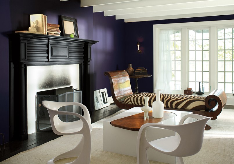
When I laid eyes on the press images for the Benjamin Moore Colour of the Year for 2017, Shadow 2117.30, my first thought was, wow, that room looks so different! Colour — and especially deep dramatic colour, sure does have the power to transform. Need more proof? If so, I give you exhibit A:

design: Darryl Carter. photo: Simon Upton
Same room painted white. This interior is of course the unmistakeable work of Darryl Carter (photo by Simon Upton). I never forget a mantel or recamier like that! I have spent a good chunk of time studying both images because A) I'm a nerd like that, and B) As a stylist I am interested in every detail. Here are a few things I notice about the Ben Moore image.
I like the Ben Moore mantel styling and even how they popped a single pear on the right as a colour statement. It makes sense in this instance since colour is the whole point. Mind you a lone pear on a mantel would not be allowed in my styling world. My personal styling credo states that fruit rarely appears in the living room and if so it must be in a bowl at arm's length from a seat. And it must be a hand fruit, actually, really only apples or pears. Maybe clementines if it's a Christmas interior. Ben Moore photoshopped the heck out of that cocktail table. At first I thought they just rotated it, but you can see it's shot from the same angle. I can see why, because it is a fairly attention-grabbing piece. I remember the story of it being that the wooden table had sentimental value to the homeowner but Darryl felt it needed to be larger for the space so he designed this white structure to encase it. So clever. And I see since they spent all their time photoshopping the table that they left the soot on the fireplace surround. Odd choice. Also, the fireplace screen is a bummer, as are the white vases on the coffee table. I'm still contemplating the modern chairs so at this time I have no comment on them. What about you? Do you like? The last funny little detail to notice is the Ben Moore feeble effort at adding sheers to the large window. That panel looks a bit skimpy and silly, no?
Despite my studying I still can't determine the answer the the most burning question of all — did they actually paint the walls in Shadow or did they reshoot and then change the wall colour digitally???? In my heart of hearts I want to believe that a location fee was paid and then Ben Moore sent in the painters, then styled and shot, then painted back to white. There is so much light play on that purple wall that I can't imagine it being post-production work.

The Darryl Carter interior isn't the only one I recognized from the Ben Moore press images. It took me a bit longer to ID this staircase but ultimately I found it in my design library in Rooms to Inspire in the Country by Annie Kelly and photos by Tim Street-Porter.


The book features the same space with white walls. The wood tone looks a lot different too but I think it's actually the same and just that the lighting conditions and printing make it look different. This staircase is in the home of creatives Carol Bokuniewicz and John Smallwood. Love this house. I can't really find a collection of the images online but you can get a sneak peek at a couple of images if you just pop her name into the Pinterest search field.
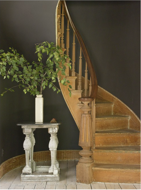
photo: John Gruen
In my image research for this interior I also unearthed this shot with the walls painted charcoal. Wow. I likey. Even though the design world is currently overrun with greys.
But I do quite like Shadow. I think I'd rather it in a velvet fabric than in paint. Delicious.
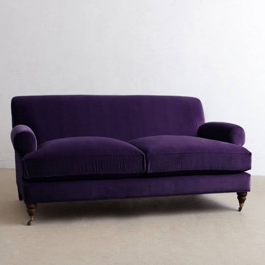
sofa: Anthropologie

Visconti twin seat, Emotional Brands, via Dering Hall
Benjamin Moore Creative Director Ellen O'Neill

Next on our #BTS journey for this year's Colour of the Year I want to introduce you to Benjamin Moore colour guru and creative director Ellen O'Neill. Well, I can't exactly introduce you, since I've never met her, but I have been a fan of her work for some time now and I'm pleased to share some insight here. Ellen has been at Ben Moore for a number of years and was for many years in a similar creative role at Ralph Lauren, where she played a pivotal role in interpreting the Ralph Lauren fashion look for the interiors and paint collections. You've seen her styling and design work a million times.
Ellen O'Neill's Hamptons Home
Maybe you'll recall this from House Beautiful a few years back. Photos by John Kernick.


Ellen O'Neill's Manhattan Studio
Here's another gem of an interior from a back issue of House Beautiful. Photos by Thomas Loof.


And lastly, I quite enjoyed the film Ben Moore made in conjunction with the Colour of the Year announcement so I am also sharing it below here. Hope you will also enjoy!